Overview
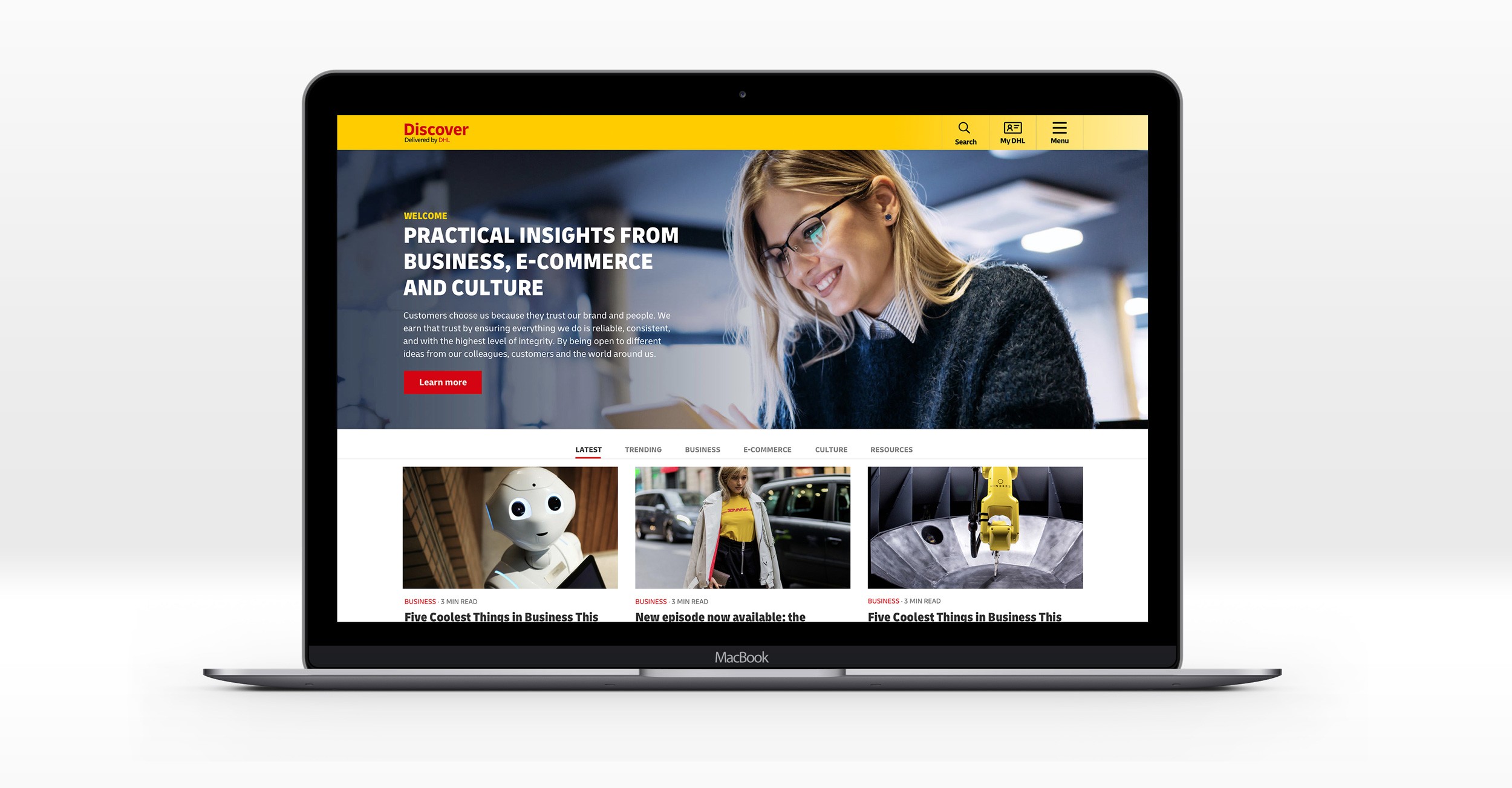
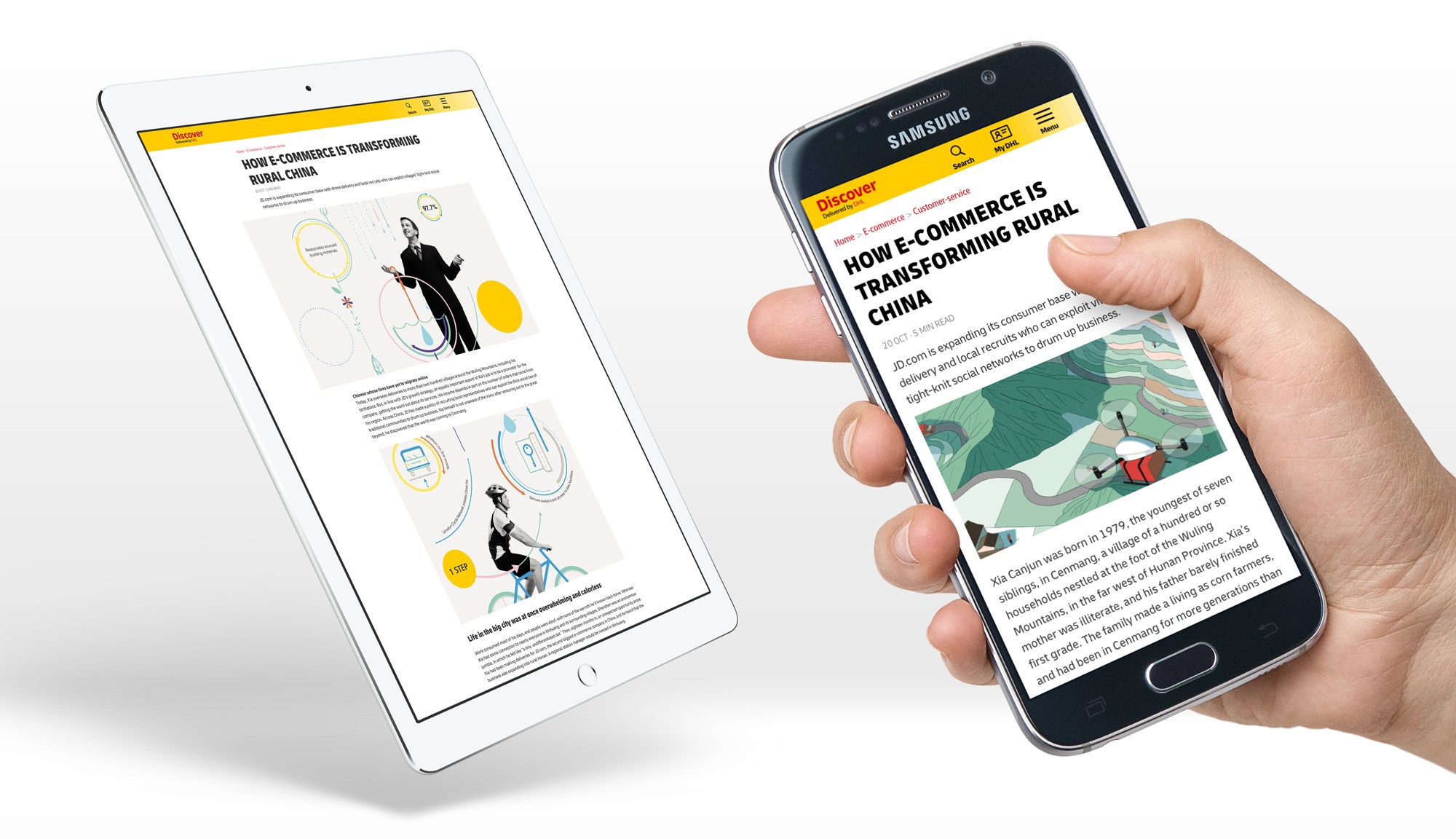
DHL Discover is a marketing website targeted at SMEs, which aims to increase brand engagement through the provision of relevant and useful business content, with the ultimate objective of increasing DHL Express account applications.
We were tasked with providing a UX review of the website. The site had quite high bounce rates so we were looking for ways to improve conversion and engagement.
My contribution
UX review
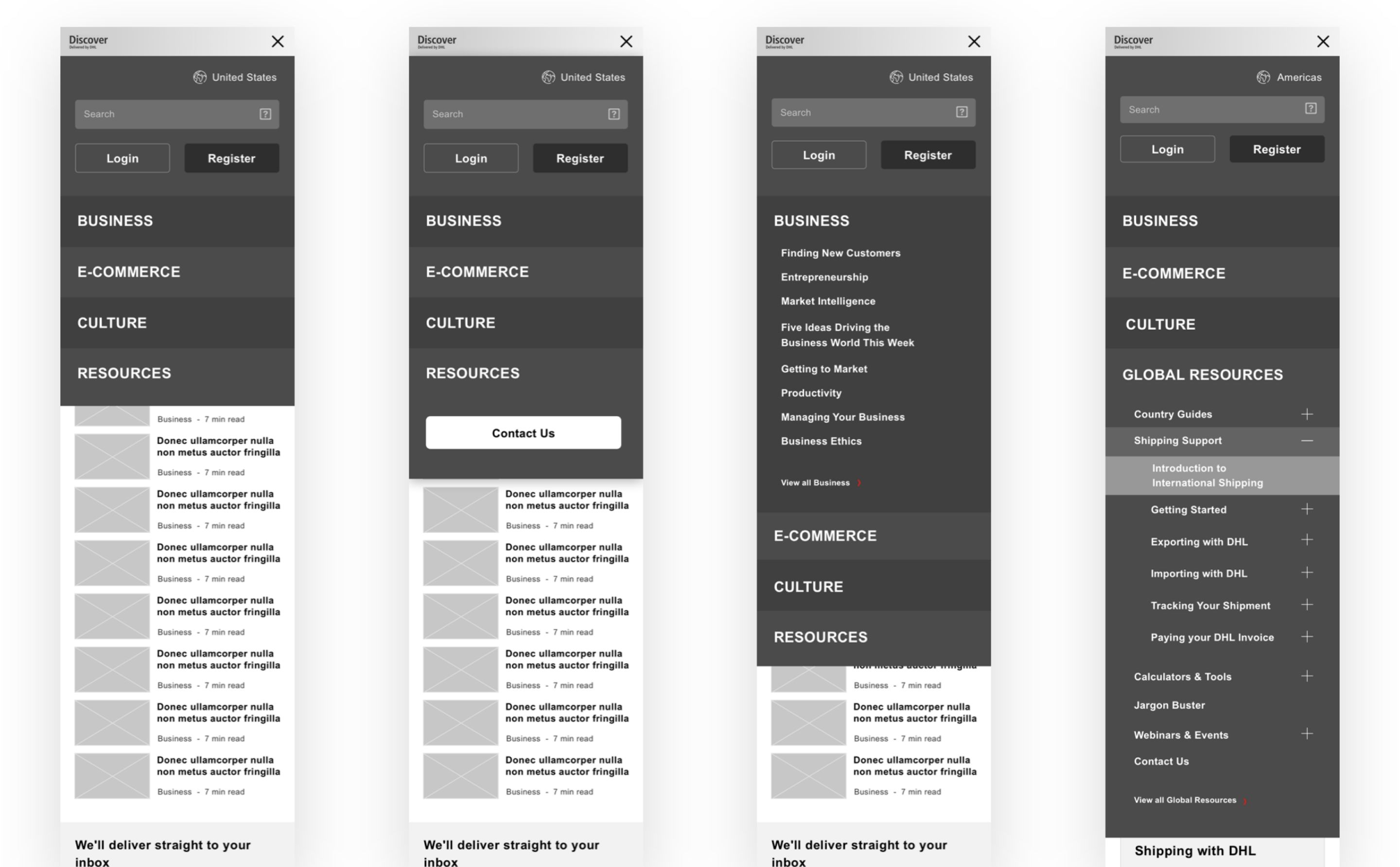
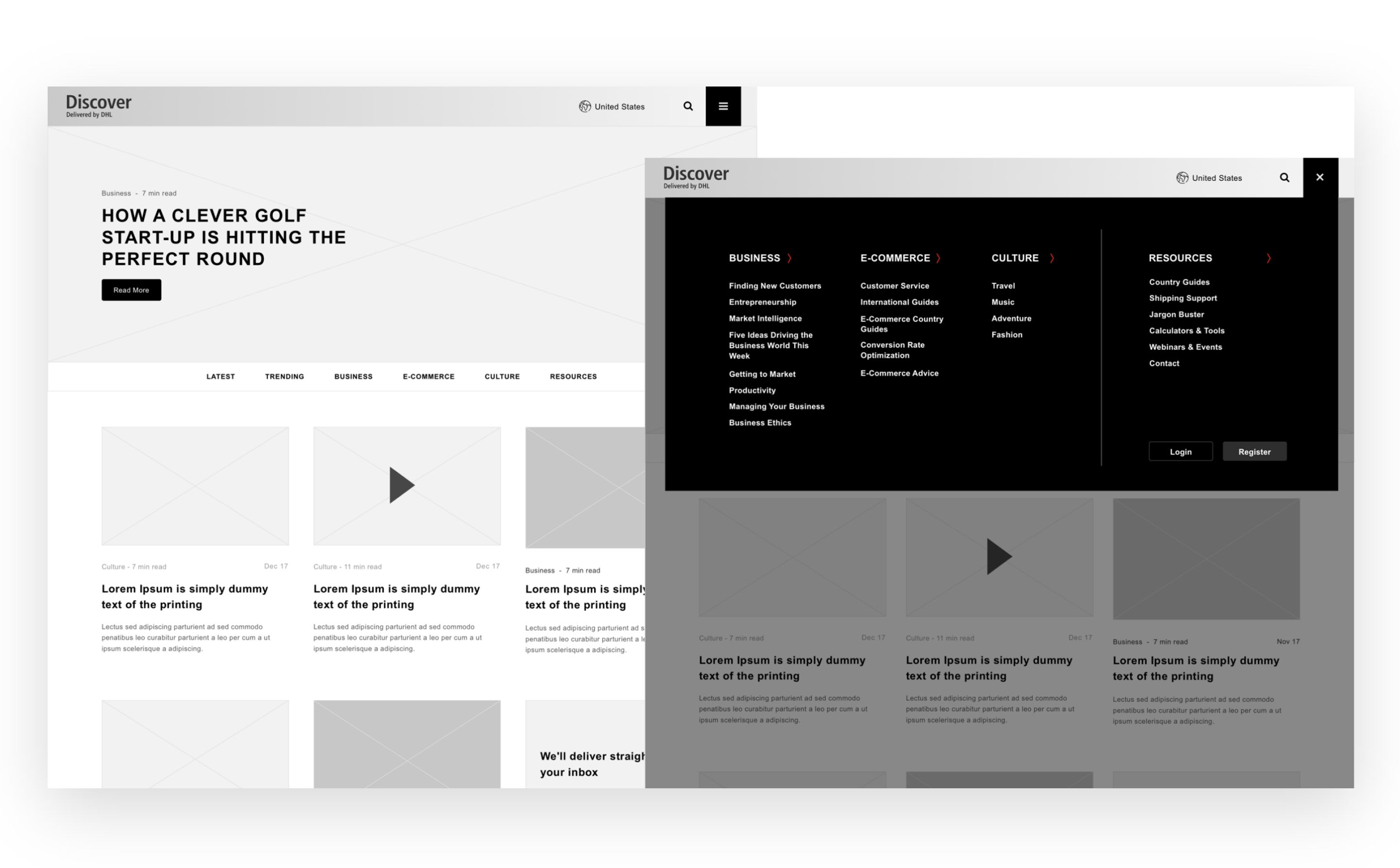
UI design
Visual design
The team
1 × product manager
2 × product designers
2 × engineers
Year
2019
Process
Analytics findings and user journeys
From looking at analytics data on the site we could gather the following insights:
• 70.1% of users are accessing the website with a Mobile device.
• The site had quite high bounce rates (average: 68.36%)
• The most typical user journey comprised of: 1. See ad > 2. Visit landing page > 3.a Continue to complete other actions > 3.b Leave the website
Problems, challenges and considerations
The site gave the user a range of actions, such as....
Consume content (Read article, watch video etc.)
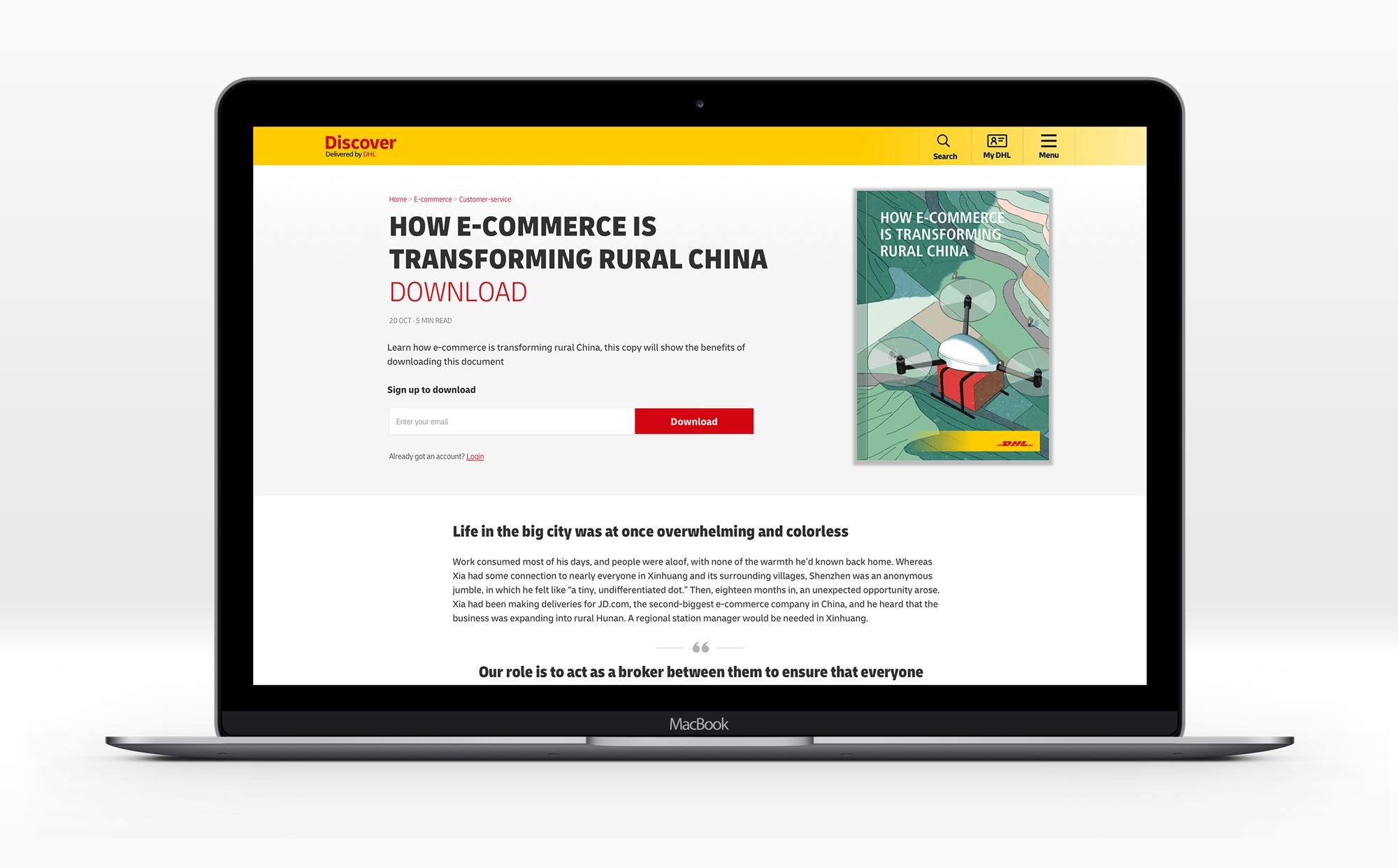
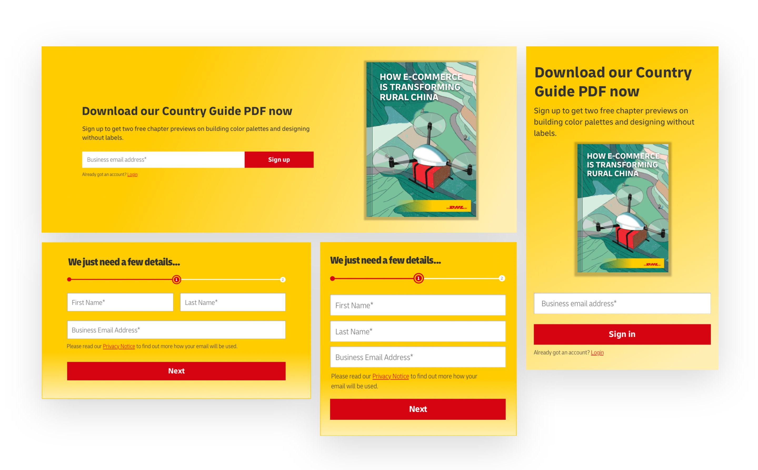
Download/access a resource (currently via discover account)
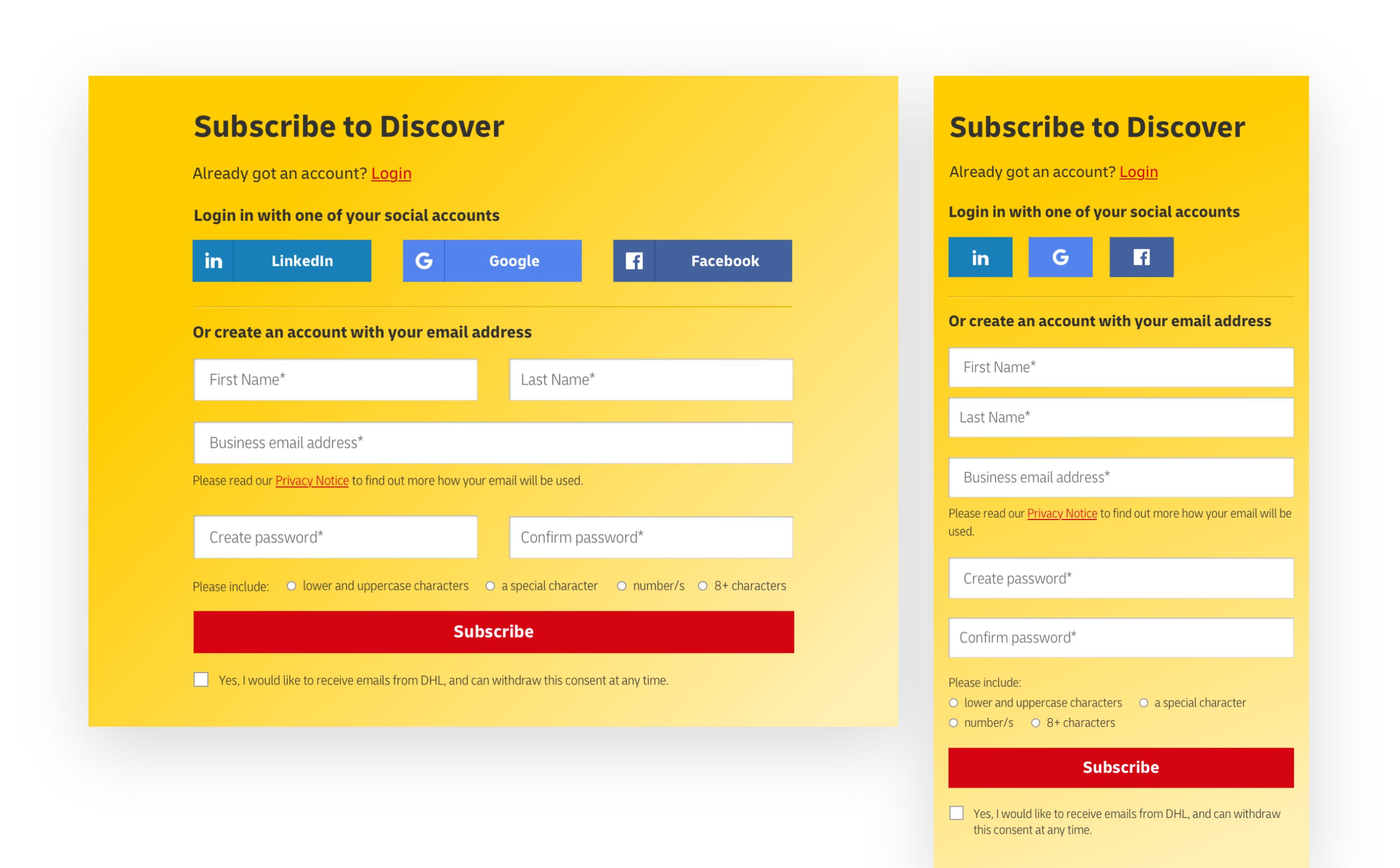
Subscribe to updates
Apply for a DHL Express account
Our challenge: How might we better serve customers on these journeys?
By creating clearer pathways for users to find the content they want and considering more closely user goals and barriers we hoped to provide users with a better experience.
Goals from redesigning and validation
By redesigning the Discover site we aimed to:
• Increase time spent on the site
• Reduce bounce rates significantly
• Increase engagement with content
• Improve sign up conversions
• Help users find content more easily
Our methods:
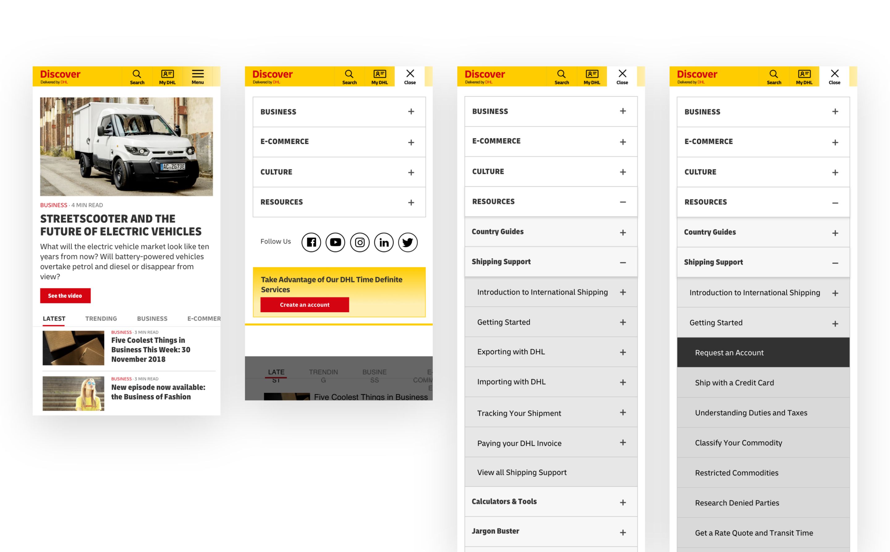
• Conducted card-sorting exercises to design the right grouping method for the content
• A/B testing modal positioning to increase newsletter sign ups
• Add a breadcrumb navigation to improve content hierarchy and improve discoverability
• Testing of key messages/CTAs
Outcome
We successfully helped to reduce the bounce rate by 9% and increased the average time spent on the site to 1 minute 53 seconds. By reducing the number of fields required to register for an account we helped to increase conversions and improve sign ups for the newsletter.
